TEST PATTERN POTATO CHIPS
Every brand wants to be your bestie. Every brand wants to be irreverent. Every brand wants to be like Liquid Death. Test Pattern recognizes this and, instead, turns to darkness.
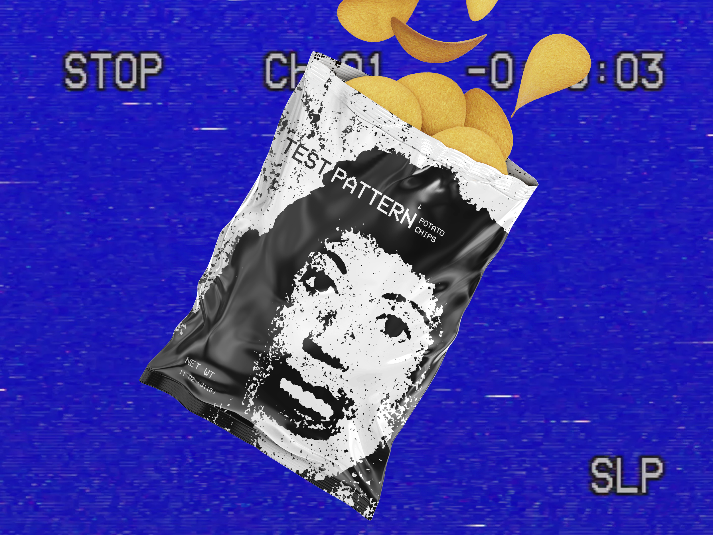
Test Pattern Potato Chips wants to tell you a scary story. The brand intentionally polarizing and incredibly divisive, offering an eerie and disquieting experience specifically catered to horror fans.
I created Test Pattern to subvert expectations in advertising while also appealing to an underserved niche of customers. You can read the pitch deck by clicking here.
BRAND IDENTITY
Test Pattern’s visual identity takes cues from a subgenre of horror called “analog horror”, known embracing gritty and unpolished visuals that create an uncanny look and feel.
“show you something” :30 commercial
Test Pattern repurposes found footage to create a chilling atmosphere built on dread and unease.

SOCIAL AD
Test Pattern “jump scares” users on social with bold visuals backed by clever CTAs

CUSTOM PACKAGING
Test Pattern arrives on customers’ porches in custom packaging to set the mood and advertise the brand during transit.

OOH DISTRIBUTION ANNOUCEMENT
You never know where Test Pattern could pop up.
Test Pattern is a brand I plan to launch when I win the lottery. Until then, I just use it to make fun stuff.
I wrote and designed everything seen here in Adobe Illustrator, Photoshop, Canva, and iMovie. I also wrote and designed the pitch deck.